Wednesday, November 1, 2017

New York City Apartment

I recently competed a New York city apartment for wonderful clients.  The two bedroom pied-a-terre boosts a large living room that allowed us to create two seating areas, complete with a sofa bed for overnight guests.  The apartment is flooded with natural light so we wanted to keep the room as light as possible.  Choosing shades of cream, beige and soft blues, created a tranquil space while reflective accents that include mirrors, glass and light floral accents keeps the light bouncing throughout the space. Window treatments were done in a luscious sheer to soften the windows and highlight the high ceilings. Right off the living room is a home office with another seating area.  To keep the space flowing we selected soothing paint colors and treated the windows with the same fabric.  I love the paint colors we used, Benjamin Moore Prentis Cream & Berber White. The colors not only add a warm backdrop to the rooms, they glow in the late afternoon light as well!


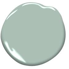
Benjamin Moore Prentis Cream CW-100


Benjamin Moore Berber White #955

Tuesday, June 6, 2017

Front Door Colors

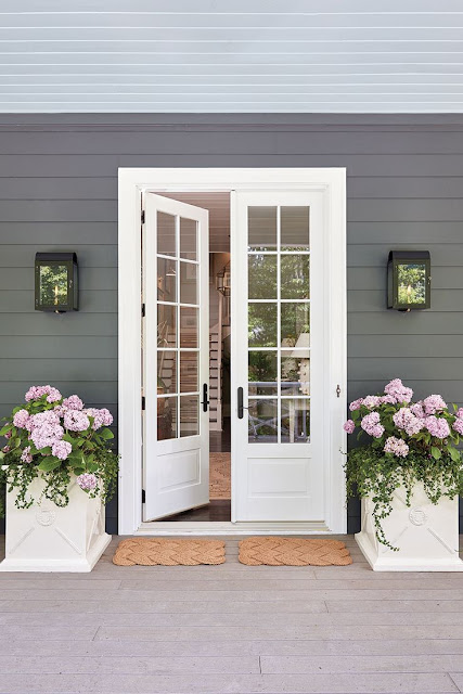
There is nothing like a pop of color on your front door to welcome guests!  The color you choose can add to your home's curb appeal as well as set the tone for what's to come once you enter.  I am in the market for a new color for my front door.  With a plethora of options, it's hard to choose!  Here are a few I love with similar recommendations to try. Before you paint, I suggest you order paper samples of the colors and look at them at various times of the day.  


Try Benjamin Moore San Clemente Teal #730


Try Benjamin Moore Banana Cream #275


Try Benjamin Moore Coral Essence #2007-40


Try Benjamin Moore Apple Blossom #479


Try Benjamin Moore White Dove #OC-17


 Try Benjamin Moore Soot #2129-20


Try Benjamin Moore Wythe Blue #HC-143


Try Benjamin Moore Coral Gables #2010-40

Images via Pinterest, Google, HGTV & Costal Living 

Thursday, March 16, 2017

Foyers

Foyers are a great space to decorate.  The focal point of your entryway is often the first thing your guests see and can set the tone for your home.  Don't be afraid of a bold color on the walls or a graphic wallpaper, these can add a lot of personality to the space.  Next, a console or chest of drawers with a lamp or set of lamps is nice.  Don't rely solely on the overhead chandelier or light fixture, adding additional lighting can cozy up the foyer.  If space allows, I think a mirror is a must!  So chose an interesting mirror to add above your furniture.  A few accents and a floral can complete the look and become a welcoming space to greet your guests.  Below are a few entryways that boost a ton of personality!

Jessica Walmsley Interiors


At Ethan Allen there are many pieces that can be combined to make a spectacular entryway!  From wallpaper, chandeliers, accents, lighting and florals in styles that range from traditional to transitional, Ethan Allen is a one-stop shopping mecca!  Below are a few examples, but the options are endless.


Photo credits:  Ethan Allen, Pintrest, Google, Houzz
I try to provide photo credits to all designers, if you find
a photo on the blog and know the designer, please email me so 
I can provide proper credit.

Tuesday, December 20, 2016

Pretty in Pink

I came across this inspiration board I made when I was working with a couple to update their living room. The room was a blank slate, with the exception of the wall color and window treatments, both of which were neutral.  Utilizing a combination of cream, pink and taupe we were able to create a beautiful living room retreat.  The room features the Savoy sofa in a cream damask and the Fairfax settee in a dual fabric option mixing a taupe velvet with a woven pink and taupe fabric.  The Giles chair in a taupe leather with copper nail heads adds some masculinity to the room.   I promised myself I'd get a better "after" picture, but that never happened....so the photo below does not do the room justice!


Inspiration- Living Room


Benjamin Moore- Putnam Ivory HC-39


Monday, November 7, 2016

New Milford Dining Room

I love how this project turned out!  This is one of many rooms I have designed for my clients who live in New Milford, CT.  As a busy mom of three active children, she has allowed me creative freedom in decorating her home.  The main objective was to create a sophisticated and elegant dining room that could be used on a daily basis for a busy family of five!  Their style, as I see it, is a relaxed elegance that is both comfortable and livable.  The color palette of blue-green, sand and cream adds a sense of calm in an otherwise bustling home. Accents in the room include the rosette mirror and mother of pearl boxes as well as the sword grass which adds an informal touch to the space and keeps the room from being too fussy.


The graceful lines of our Cassatt chair is perfectly paired with the Cooper table in an earl gray finish while the grand scale of the Lisi chandelier adds drama to the space.  The artwork, oversized as well, not only adds visual interests but also reminds the clients of their time spent in Colorado.


If you need help with any rooms in your home and are interested in working with me, feel free to email me!  I have experience working remotely with clients.

peggy fortuna interiors 
203 743-8225
914 393-0713


Thursday, September 8, 2016

Stylish Shelves!

Arranging a bookcase can be a challenge. It can be a true piece of art once completed and while you can enlist the help of your interior designer, here are a few tips to guide you if you are staging it solo.

Take everything off the shelves to begin and remember to focus on the following: color, texture, size, balance and layering.

Color: Try selecting an accent color for the back of your bookcases. If the bookcases are a wood tone, try painting the back of the cases white, this will make your objects stand out. If your bookcases are white try adding a bold color or even a wallpaper to add punch and interest to your room.


Texture: Use a variety of textures. Along with books, try to incorporate glass, ceramic, photos, artwork and objects of assorted sizes.

Size: Size does matter, too many small items will get lost on your shelves. Add some larger objects and display smaller objects on top of books stacked horizontally.

Balance: It is important to balance the display on your shelves, if you have added a lot of height to one side, be sure to balance it with another object with some height on the other side. You can group your books by color, or for a more mono-chromatic look cover your books in paper or display the page side of your books!

Layering: Try propping an item in the back of the shelf and add books, etc. in front. Layering can add a lot of interest. Also don't forget to alternate your books on the shelves in horizontal and vertical groupings.

Utilizing the above suggestion should help you achieve a beautifully arranged bookcase.  If you need some inspiration in the process here are a few examples of some stylish shelves.


Photo credits: 

House Beautiful, Centsational Girl, Pintrest & Decorpad